Why Design Matters
OR
From My Kitchen Cabinets to the Russian Far East
Last year, I devoted many months writing and designing the Conservation Investment Strategy for the Russian Far East—which was about, among other things, growing markets for wild salmon in Kamchatka, scientists and indigenous hunters teaming up to monitor walruses in Chukotka for climate change impacts, mobile fire brigades fighting wildfires accidentally set by farmers burning their fields. More fascinating than you might think.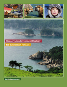
The client, Pacific Environment, was thrilled with the report and I was proud of it too. It’s some of the best work I’ve ever done.
What I found interesting, though not surprising, was that almost all the kudos were about the design, even though that accounted for only a quarter of the work.
That’s probably because most people didn’t read the entire 80 pages. And those few who did appreciated that the design elements reinforced the message of the document.
It’s a reminder to me, as a writer and designer who identifies more as a writer, that in many cases, design is as important or more important than the words.
My plan here is to deconstruct my design process to see if I can learn from what I did, and maybe others can as well. It’s not that I didn’t consciously make decisions along the way as much as that I’ve been a designer for decades and some of those decisions were almost intuitive. Looking back I can see more clearly what I did.

A word about the writing part. There was heavy slogging along the way—I had to distill hundreds of pages of dry scientific language into a compelling narrative, and there were moments when I was pulling out my hair. It’s not that the content I had to work with boring, though some of it was. But it wasn’t exactly high in entertainment value, so one of my goals was for the casual reader to get the basic message from the decks and captions and headlines.
Here’s an example—I didn’t have a photo for this story, but the concept was pretty straightforward, that satellite photos could document pollution much more effectively than a government agent who has to make an appointment to visit the mine.

What Do Readers Read?
Photos, of course, play a huge role, not just the images themselves, but the captions, which get read, depending on who you listen to, four times more often than the body text. The best captions reinforcing the message of the document. So, for example, the caption for the photo below of two tigers growling at one another doesn’t reference the photo directly, as much as it provides important context—how there are only 500 Amur tigers left in the wild, but they are on the rebound.

There’s no need for the caption to repeat what the reader can see in the photo.
I also looked for ways to feature people, in the narrative and the images. So much of the content I had to work with was scientific, like the names of threatened species, or fishing harvest data.
The chapter on Chukotka, which is across the Bering Strait from Alaska, and equally frigid, didn’t have a lot of compelling stories. All of the photos I had to start with were of stark landscapes. None of people. In my search for better images, I came across a wonderful website and story by a photographer from California, Sasha Leahovcenco, who was born in the former Soviet republic of Moldava and journeyed to Chukotka to take photos of indigenous people there, most of whom had never seen photographs of themselves before. He was happy to let me use his photos. Here’s one of my favorites.

Five-Column Grid—It’s Great to Be Odd
Even though I’ve designed dozens of reports like this, I deliberated carefully on what kind of grid to use. Mostly, for reports that are standard 8.5” x 11” size page, I use a simple two column grid, but for something long and complex like this, with maps and photos and charts, I chose five columns, which allows for both uniformity and variation. The default layout was two blocks of text, one two columns wide, the other three. It’s more interesting than two columns the same width.
It also allows for one column of white space when necessary. I found this very helpful for fitting copy. When text was added or cut, and I didn’t want to add extra pages, I could expand or contract the column width and still have a unified look.
Here are two chapter-opening spreads where the left-most column is primarily white space, and the right page uses the 2 + 3 grid. Then comes a text-heavy page with 2 + 3 on both the left and right side.


 Note also how the map, which is a dominant element in the first spread above, is used on a smaller scale at the bottom of the second spread, as a locator map for the particular region being addressed, in this case, Chukotka. Maps are especially important when readers may not know the area, but even when they do, they help anchor the story.
Another design element that helped orient readers (pun intended) was including a mini-contents box at the bottom of each chapter’s opening page to supplement the map. This was a big and complicated document, and though these mini-tables of contents were redundant to what was in the main table of contents, I wanted to make it as easy as possible for readers to know where they were and what was coming.
Color Bars
Arguably, the most important design decision was to use wide horizontal bars in gold, olive, and rust to feature what I call “decks.” (They are often referred to as “pull-quotes,” but for this project, I more often distilled an important point into a sentence that might been a paragraph in the text.)
Like the grid, the regular use of the color bars contributed to a unified design, but they were even more versatile than the grid.
Because I used the color bars in a slightly different way each time, I was able to use them more than a dozen times without being repetitive. What was consistent was the color palette, the height of the boxes, and the typeface, and what varied was the length and placement of the stripes, and the specific colors. In some cases where there were three lines, I used all three colors. In some cases, all three stripes were aligned on the left. But other times, I staggered them or only used two colors. (In a few places, where I was already using the olive green as a background, I added a fourth color, a darker green to the color bar palette.
Below are a some examples. You can see that the placement, alignment, colors, and length vary, and of course, the words do too, but the palette and typeface keep things unified.


From My Kitchen Cabinets to the Russian Far East
Choosing a color palette is one of the most important parts of a design, and there are almost an infinite number of options.
I knew I wanted warm colors to counteract the arctic content. I started with rust, one of my favorites, and before I realized it, I was working with roughly the same colors I painted my kitchen cabinets in Berkeley a decade ago. (I know I can’t keep using the same colors over and over, but recycling a palette every ten years doesn’t seems to be a problem.)
Back around the turn of the century, my kitchen cabinets were medium brown wooden doors and drawers that were becoming increasingly ugly with wear and tear. On a trip to Mexico, I purchased colorful ceramic (Talavera) knobs from street vendors in San Miguel de Allende, and my plan was to paint the cabinets white and add the knobs for color. The first few I painted didn’t look as interesting as I’d hoped.
So I played with some richer, more intense colors, and after some trial and error ended up with three colors—rust, gold, and olive green. You can see the cabinets here.

Reinforcing the Message, Telegraphing the Character
Design that is visually appealing and memorable is a strong start. But not enough. The most critical element of good design is that it telegraph and/or reinforce the message and character of the content. Is it authoritative? Whimsical? Serious as death? Important, but not self-important. In the case of the Russian Far East document, it was important to get across the comprehensiveness of the report. Because the length of the report and the long list of contributors at the beginning already characterized it as comprehensive, I didn’t need to do much more with the design to reinforce that. Instead, my primary design goal was to make the report more engaging and welcoming. The colors and the maps and the intimate closeups of people helped with that.
Recent Comments